

soCash
For in-depth case studies, please drop me an email :)
soCash is a mobile app that enables cash withdrawals at any shop across the island, effectively replacing ATMs. I oversaw both product and marketing design, however the majority of my time was dedicated to the former. I was also tasked to improve and humanize user-facing copy.
UX Screens
Below are some proposed user journey screens covering registration, set up, and cash withdrawal. They were made before the UI/UX revamp, with existing engineering limitations in mind. The flow below is a “happy flow”.
Registration Flow
Challenge: Drop offs on the first page (out of two) of registration.
Solution:
Introduce an onboarding screen with value props and rewards upfront.
Decrease the amount of fields required for registration, with help text to emphasize how users would profit in exchange for an accurate email address.
Introduce an OTP screen for mobile number verification, as this was imperative for cash withdrawal.
Action-oriented CTAs were also important to guide and set expectations for the proceeding steps.
-

1. Onboarding
Display bite sized benefits of the app.
-

2. Sign up (1/3)
Display min. required fields to for quick sign up process. Explanation text with benefits as to why an email is required.
-

3. Sign up (2/3)
Explanation text to ensure accurate information is submitted.
-

4. Sign up (3/3)
OTP page to ensure accurate mobile number, with options to troubleshoot.
Logging In and Setting Up
Challenge: Users aren’t set up properly from the get go, which causes failures when they attempt to withdraw cash.
Solution:
Capture the user’s initial enthusiasm upon logging in to set up - making it part of onboarding.
Aside from cards, introduce DBS PayLah! as an option.
-

1. Log in
Primary goal: Login
Secondary: Signing up -

2. Set up (1/3)
The first screen, when no cards, banks or apps added. Users are able to choose what they want to add to proceed.
-

3. Set up (2/3)
When more than 1 card is added, with an indicator of which card is in use / primary.
-

4. Set up (3/3)
Information is pulled from the registration flow, with an option to edit the details. Short text to explain the need for accuracy.
Cash Withdrawal Flow
Challenge: Lack of guidance and instruction about how the withdrawal process worked.
Solution:
Introduce help text where necessary.
Display preferences/details along the journey, based on feedback that users aren’t sure what they selected prior.
Present rewards and benefits to nudge users to complete the transaction.
-

Cash Withdrawal (1/5)
Ability to type in amount to withdraw, and to add/decrease in $10 intervals.
Highlight the card that’s currently in use with the ability to change; with the same treatment for location. -

Cash Withdrawal (2/5)
Display the withdrawal summary, with the ability to modify the details.
Distance for collection points is indicated, followed by a carrot to further encourage users to withdraw.
Users are also able to sort by distance, rating, and latest closing time. -

Cash Withdrawal (3/5)
Confirmation screen for cash withdrawal, with the option to cancel.
-

Cash Withdrawal (4/5)
Instruction screen to guide the user on what to do next. Full address is displayed with the option to call the shop owner, or to launch Google Maps.
Clear situation description is explained with next steps, and a CTA to launch the camera to scan the QR code.
There is also an option to report an error if it’s unsuccessful. -

Cash Withdrawal (5/5)
Successful withdrawal screen, with all the basic details. Users have the option to rate the store, and tangible benefits from withdrawing with soCash is reinforced.
Main CTA to encourage users to make another withdrawal.
UI Screens
Registration Flow
Approach:
Two versions were proposed - Vibrant and Light. They were tested to see which version yielded higher registration rates, but it was inconclusive. The Light version was later on chosen for simplicity, and to tie with the rest of the screens.
-

Vibrant (1/3)
-

Vibrant (2/3)
-

Vibrant (3/3)
-

Light (1/3)
-

Light (3/3)
-

Light (2/3)
Cash Withdrawal Flow
Approach:
Two versions were proposed - Vibrant and Light. They were tested to see which version yielded higher registration rates, but it was inconclusive. The Light version was later on chosen for simplicity, and to tie with the rest of the screens.
-

Cash Withdrawal
If a returning user earned Free Cash to be used for their next withdrawal, an indicator would be shown at the bottom.
-

Free Cash Breakdown
When the label (“You have Free Cash”) is tapped. A dynamic table displays how it works behind the scenes for clarity.
The debit amount is updated depending on what the user selects. -

Change Location
If the user wants to enter an address manually.
-

Select Cashpoint
Once the user selects “Find nearest Cashpoint”, a list of Cashpoints is displayed from nearest to furthest.
If a Cashpoint is closing within the next 30 minutes, it is highlighted for convenience.
-

Confirm Cashpoint (Tab 1/3)
When there are ongoing promotions happening in-store, shop owners are given the opportunity to advertise at the top.
Given the amount of information needed to be displayed, tabs were introduced.The first shows shop-related information: directions, opening hours, etc to help users navigate.
-

Confirm Cashpoint (Tab 1/2)
The second tab shows withdrawal-related information: method of withdrawal, and a table that shows how it works for clarity.
-

Confirm Cashpoint (Tab 2/2b)
If the user were to click on “Tips”, to ensure a seamless withdrawal.
-

Confirm Cashpoint (Tab 3/3)
The third tab displays T&C’s if a purchase is required to make a withdrawal. If it is not required, it will be indicated.
-

Confirmation Screen
When “Confirm Cashpoint” is clicked.
-
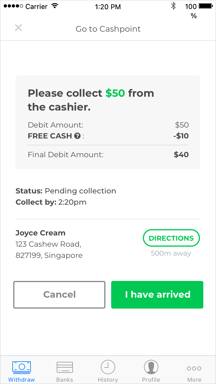
Go to Cashpoint
There was a consistent feedback that users were unsure about how much they needed to collect from the cashier, especially when Free Cash was involved.
With that in mind, it was intentional to over communicate how much a user needed to collect from the cashier. -

Scan QR Code
When “I have arrived” is clicked.
-

Successful withdrawal
When the user successfully collects their cash and the cashier selects “Collected” from their end, this screen will be displayed for the user.
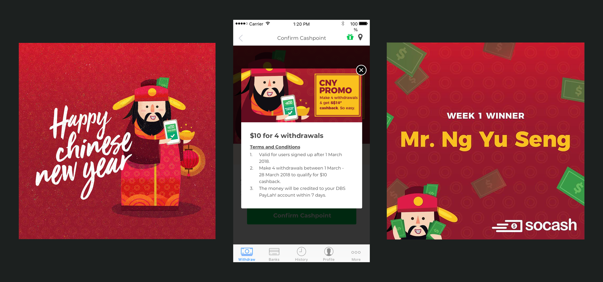
Artwork for a Chinese New Year Campaign - it was mainly used for socials and in-app promotions

Illustration for social media (IG)