TradeGecko Brand and Marketing
I oversaw Brand and Marketing Design which allowed me to set design directions and templates for all assets outside of the core application. I also managed Lifecycle Marketing that involved mapping out Email Workflows.
Brand Guidelines
| Context | As the business grew, the brand and design had to folow suit. |
|---|---|
| Challenges |
|
| Impact |
|
| Goals / Success metrics |
|
| Timeline | Perpetual updates throughout the year, and it was still a WIP up till TradeGecko was acquired. |
| My role | I was responsible in updating and setting new guidelines, evolving the visuals, layout and typography. To test the scalability/flexibility of the guidelines on website pages, online tools, emails, graphic assets (eBooks, social media graphics, ads, etc) - I worked with a frontend developer. |
I’ll touch briefly below on my thought process, and guiding principles when it came to different design sections before moving to application:
Logo
| Goal: To streamline sizing, placement, and guidelines for internal teams and vendors. | |
| Guiding principles | The logo integrity must always be maintained: It has to look good (high contrast) on any image or coloured background. * This sets the baseline and direction for the brand’s colour palette. |
|---|---|
| We need to be proud of the brand: The size of the logo needs to be at least 40% of the canvas in width (approximately 40% x 10% ratio). | |

Colours
| Goal: To unify the colours across all assets. | |
| Guiding principle: Everything centers around Moko Green, the role of other colours are to flatter, or be in harmony with it. | |
| Challenge | Solution |
|---|---|
| Too many colours, assets looked inconsistent. | Cut down the basic colours to a minimal palette. |
| Colours that worked for web pages did not work for visuals. | TradeGecko as a brand is illustration heavy, and to make the visuals work, excessive colour divergence became normal practice. Taking all of our assets into consideration (web components, vector visuals, product screenshots, videos), I decided to split the colours into:
|
| Greys looked outdated. | The best compliment to Moko Green was dark blue. Therefore more blue was added to the existing greys as a refresh. |

Illustration
| Goal: To establish visual consistency in terms of sizing, simplification, and layout. Also to evolve our illustrations with the rest of the brand. | |
| Guiding principles | Implemented a 60-40 rule: To create a visual hierarchy for full illustrations, it required approximately 60% whitespace and 40% object. |
|---|---|
| Consistent sizing and templates: Introduced grids, alignments and set a master template for icons. | |
| Approach | To streamline our illustrations, I revised, updated and purged through some 250+ icons and visuals. |
Some examples of how I approached cleaning up our sprites:

Simplifying Vectors
Less noise, more emphasis on contrast, shape and size (chunkier details, rounded edges where applicable).

Removing Clutter
When it came to the TradeGecko software, knowing the context of the visual (what’s the content? Information? Goal?) determined which unnecessary details were removed.

Typography
| Goal: To create a set of pairings and weights that work seamlessly no matter the context (print/desktop/mobile, H1/H3, H3/Lead-in, H3/Body, etc). | |
| Guiding principles | The typography should be able to stand on its own, without the need of supporting visuals. |
|---|---|
| Clear typography hierarchy must always be visible: While being mindful of legibility, scannability and structure. | |
| Approach | Firstly, define our context: Analyzed typography scenarios by laying out all existing text modules in our CMS. I also frequently referenced content guidelines to determine length of sentences and SEO keywords. |
| Testing, tweaking, repeat: We (design team) conducted a lot of internal testing with our teams for faster feedback - by sending out surveys and Five Second Tests (and variants of it). | |
An example of the new typography guidelines applied:
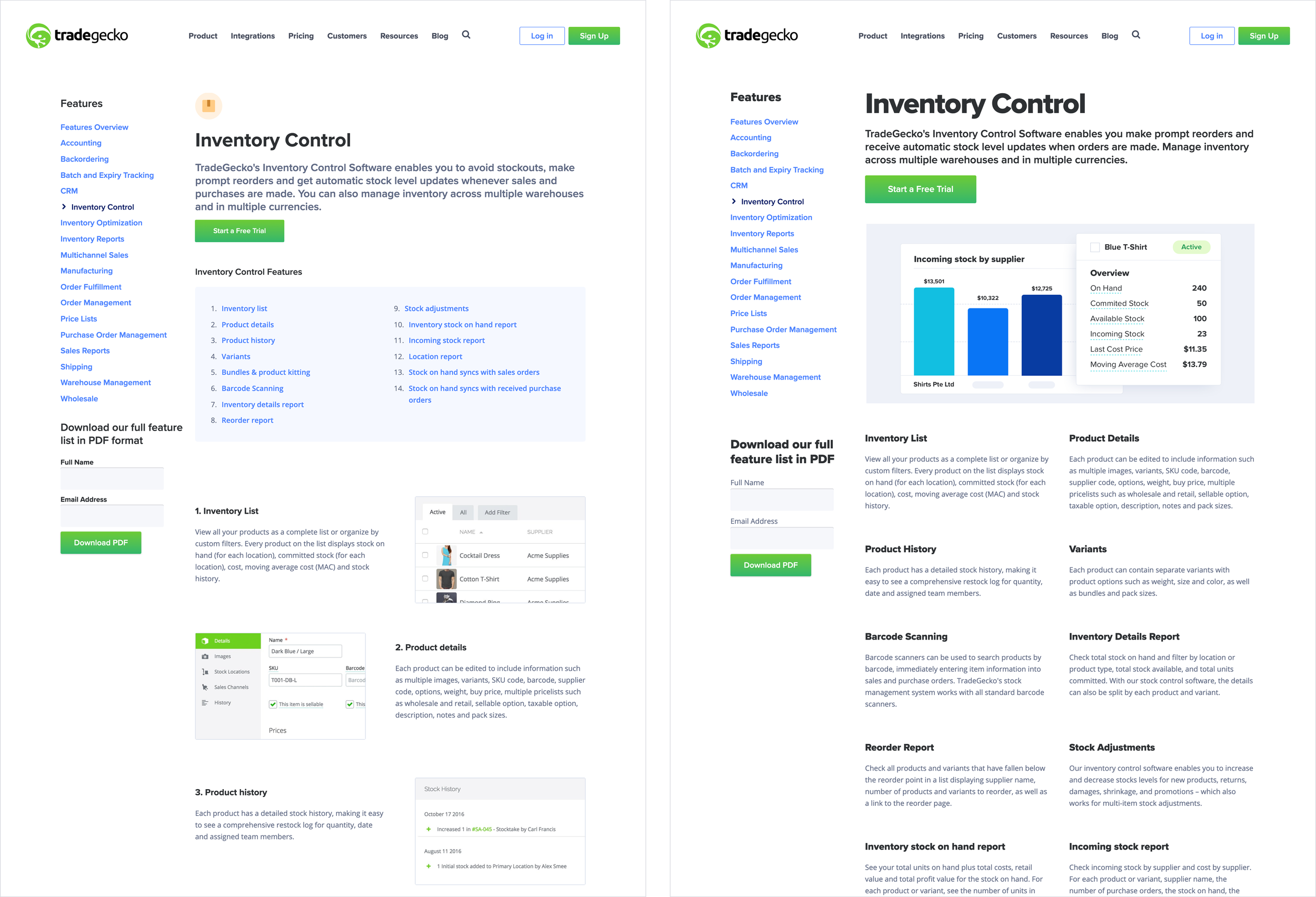
Before and after: Inventory Control Feature page
Product Screenshots
Goal: Simplify and consolidate our screenshots to lessen the cognitive load (As a user, what am I supposed to focus on in this screenshot?).

Unifying product screenshots for Marketing
Unlike the Knowledge Center/Helpdesk, screenshots for Marketing doesn’t need to be an absolute carbon copy of the existing application - if anything, it can prove to be overwhelming because there are too many items going on.
Understanding the context the screenshot is for, I can narrow down to the feature that is most relevant to the targeted ICP and present it in a simplified, but still accurate visual.
After getting the green-light from the Product Team, this was the outcome, and below are some of the screenshots that I designed.

Product Screenshots are mostly featured on TradeGecko Product Features page, like the one below:

Example of Brand Guidelines applied for a Paid Landing Page: Refreshed typography, colours, illustrations & product screenshots.

Emails
The new guidelines were also implemented for emails.
| Challenge | Volume: With 40 existing workflows consisting of 120+ automated emails, they had to be individually updated due to how it was set up. |
|---|---|
| Approach | Updating and monitoring one workflow at a time: This gives an opportunity for iteration before implementing the rest, effectively reducing potential double work. |
| Design Opportunity: Emails were an avenue where I started testing the effectiveness of GIFs for feature education. | |
| Impact | Starting with Onboarding Emails, over a period of 6 weeks:
|

New illustration guidelines applied to emails

Gifs in emails: Quick tutorial
Sometimes gifs are used as a how-to (and can be doubly used as a standalone graphic by customer teams) or to encourage users to perform an action in-app.

Gifs in emails: Quick showcase
Gifs were also used as an opportunity to show brief glimpses of different parts of the app where there are updates.
Campaigns
For acquisition campaigns I deliberately choose sharper and brighter colours to break the constance of the brand. This is the only instance where slight divergence in colour and typography is allowed, since it only runs anywhere from 3-6 weeks with the intention to stand out.
Here are some of the design directions that I’ve set:

Main Artwork
While campaign colours are slightly tweaked, it was imperative that it still resembled TradeGecko.

Example of promo items on the pricing page and trial emails.


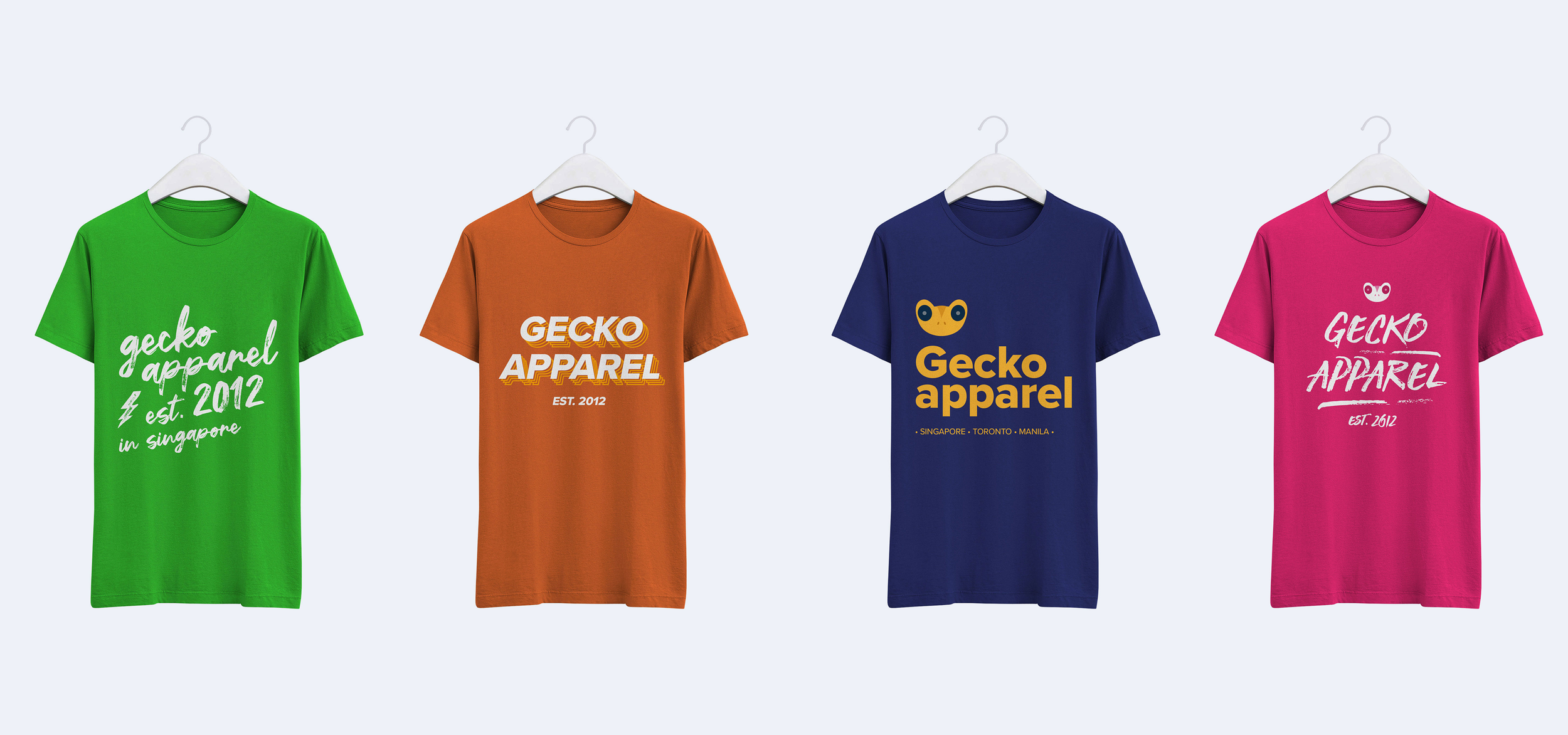
Gecko Apparel
Expanding on the updated brand and design, I had also created a set of apparels for the purpose of having presentable product images (and from pure design delight!) to use on user facing platforms (Marketing site, B2B storefront, Product demo accounts).
Apparel was chosen because it was one of our ICP verticals, and this also unexpectedly impacted user acquisition (aesthetic-usability) via the customer teams.
As it started to be widely used by various teams across the organization, they started appearing in demos, screen recordings and app updates.
Impact: Multiple TradeGecko customers reached out wanting to purchase the non-existent apparel.